

Partners Real Estate - Design Challenge
Partners Real Estate recruited me in 2023 to reimagine their branding for the provided visuals in order to inject creativity in more open means while maintaining their set guidelines.
I helped with social media post designs (below), I reformatted a print add (with accompanying GIFs for web), and I reformatted an award spread for an internal publication.
(All images and visuals belong to Partners Real Estate).
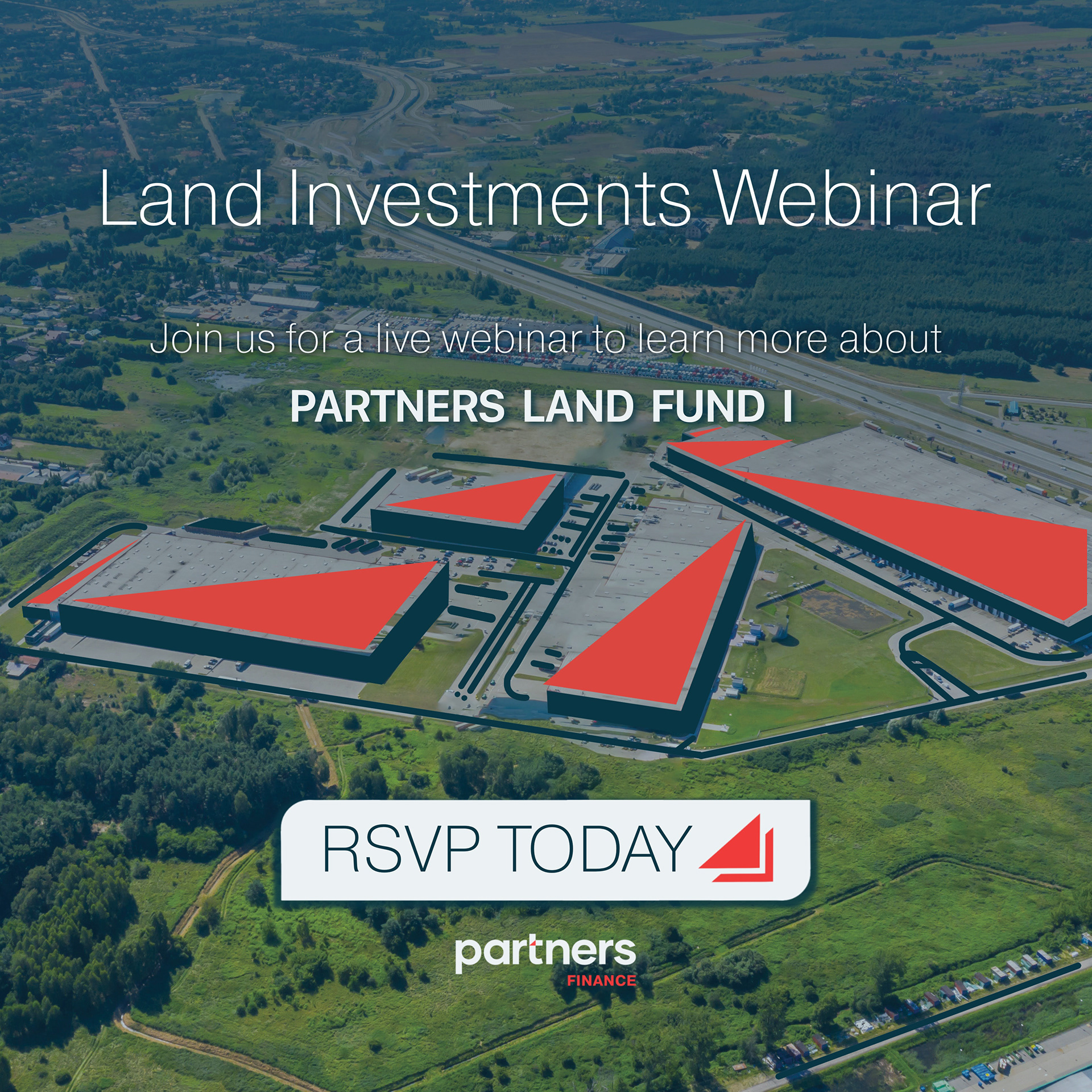


LindedIn Ads
The ads you see above and at the top of the page were for LinkedIn. They had the same pictures featured but were uniform and missing visual aids.
I created a larger stacked red triangle from the existing Partners logo in order to lead the eyes as a visual aid for this campaign mock-up. I also used this element for the remaining examples below.
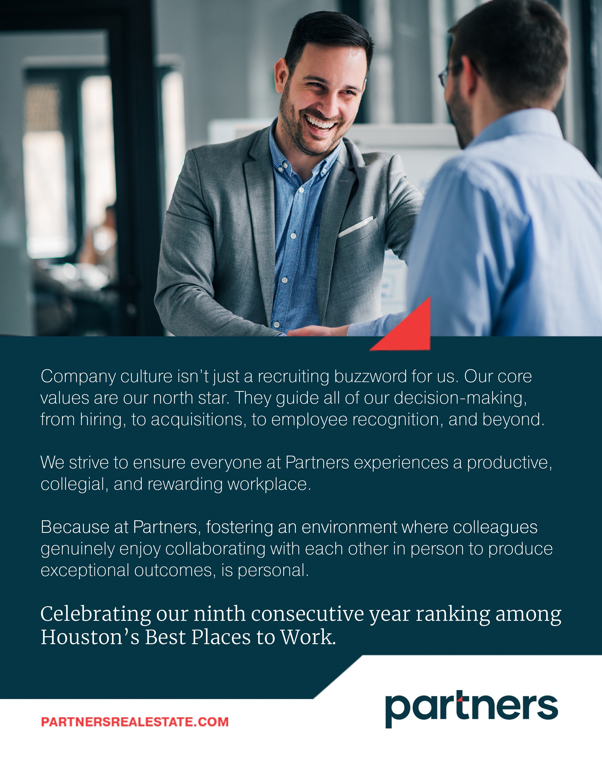


Best Place To Work Ad and GIFs (above)
The Best Place To Work Ad consists of a print ad with two GIFs for web use.
I used an existing photo while using the red triangle visual aid in order to illustrate connection between the collaborative hand shake scene in this featured in-house setting.
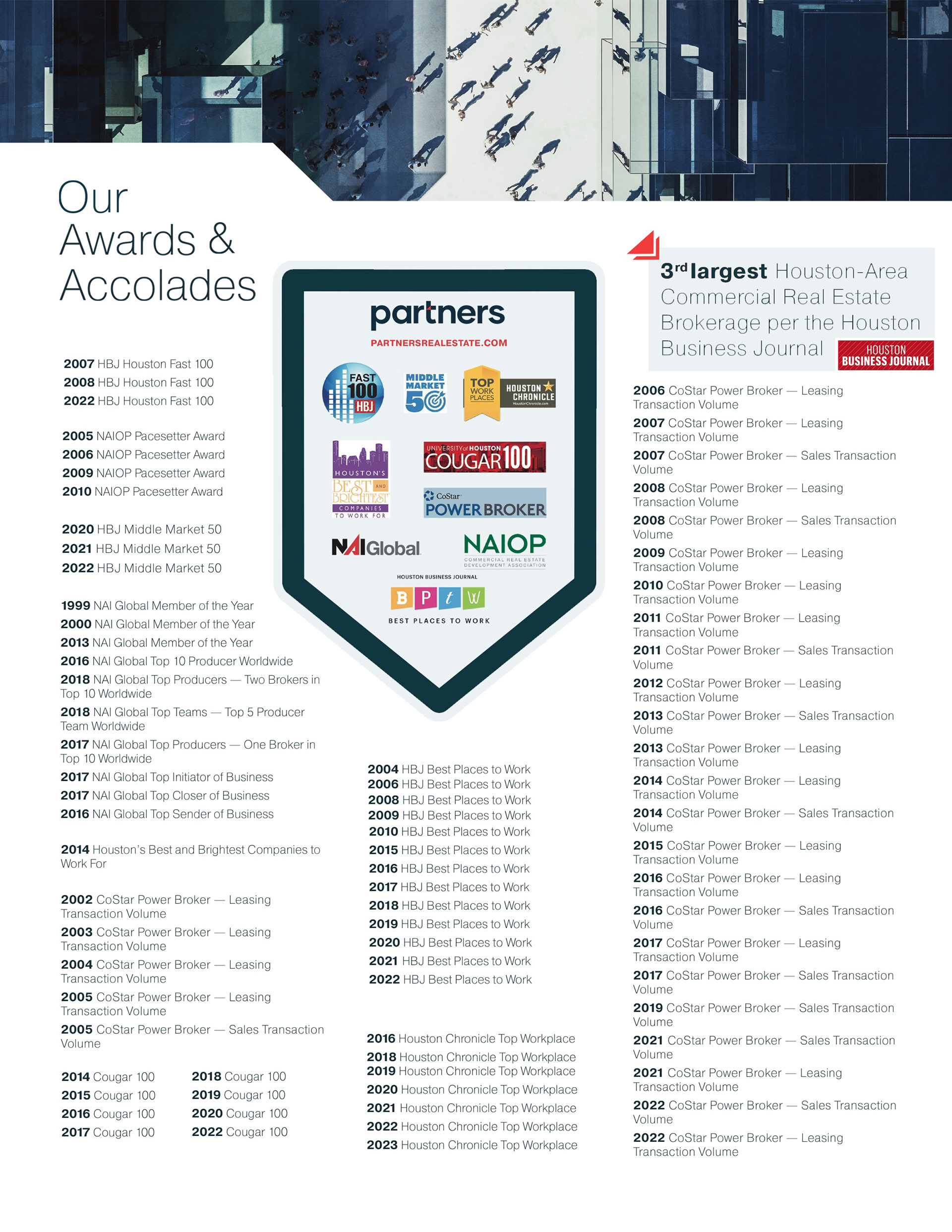
Awards & Accolades (Print internal ad)
The spread above was reworked to include a visual hierarchy as the previous version had the logos of each organization spread throughout making it hard to follow.
I also generated a banner to maintain the organization logos much like championship banner hanging from the rafters.
Conclusion
The design challenge was especially refreshing since my experience was lacking in corporate design. What a better place to exercise this then with Partners. I sought to bring a cohesive and user-friendly revamp to the existing works and I absolutely accomplished this. I’m excited to work more with clients and organizations that are seeking the same.